CovidTrail
A Tracker that lets you see a creative data visualization for Covid 19 cases
Screen based Interaction, California State University East Bay
Creative coding with P5.js | Timeline: 3 weeks
Role: UX/UI design, interaction design, defining dataset and development of prototype
Tools: Adobe XD, Atom, Google docs, Google slides, Github
Project Overview
Since COVID-19 had little research around December of 2019 and January of 2020, it was easily overlooked by the president and government and quickly became a global pandemic around March and April of 2020 that put the world into a huge lockdown, and has since then taken the lives of millions of people worldwide.
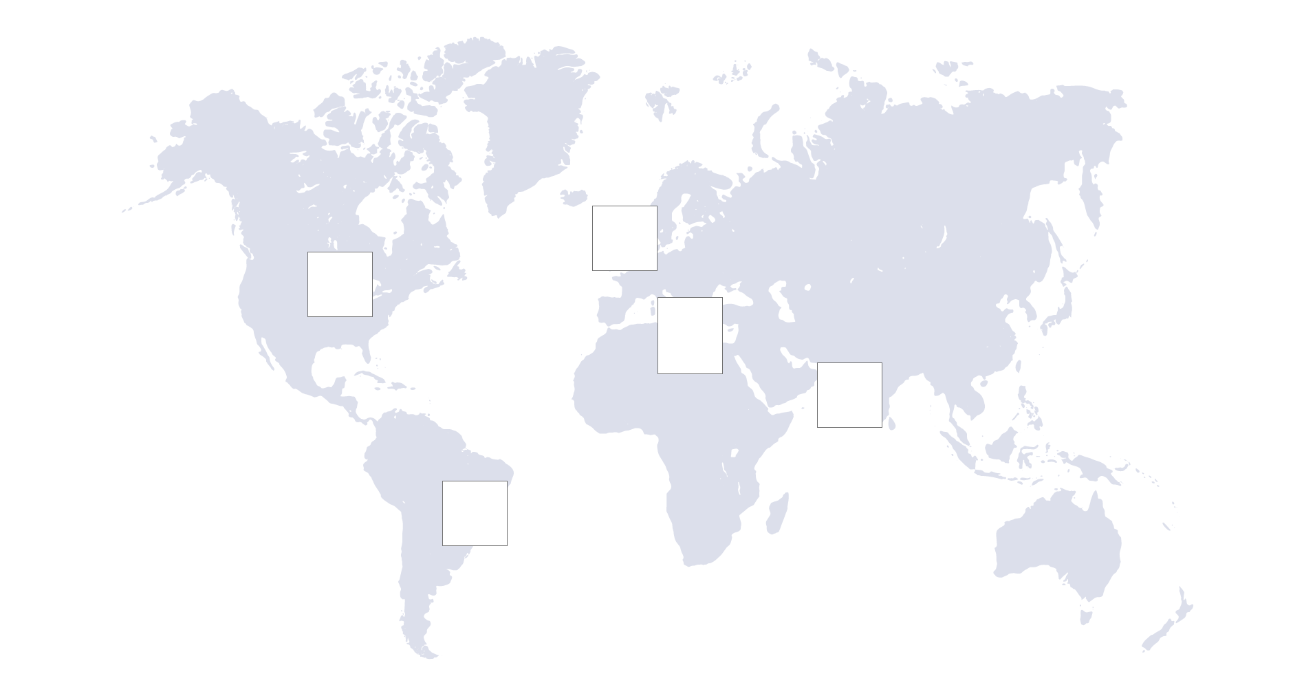
“CovidTrail” is a visualization that displays information about the COVID-19 rates in five different countries: the United States, United Kingdom, Italy, India, and Brazil. This application was created to inform the user about the dangers of COVID-19 and how the rates of cases and deaths are continuing to rise as the days go by. The visualization will also have a map that outlines the five different countries mentioned before that the user can press on, and it will display the information about COVID-19.
Using user-centered design, our project sets out to produce an app that makes a statement helping to address the seriousness of this virus using current available data.
Problem statement
Ever since COVID-19 started to really erupt in 2020, people had a hard time coping with the new guidelines and changes to our lifestyles. Within the past two years, COVID has affected millions of people around the world and caused many setbacks for businesses, schools, and social life. Still as we set out the lethality of this virus, people are still out taking it lightly and lead their lives in skepticism.
With the emergence of a new variant and the addition of new lockdown and vaccine measures many are either exhausted or skeptical about the lethality of the virus. It is important to remind everyone the full extent of the virus’ potency.
Design Methodology
As the design methodology for the project, user centered design was used. The project was divided into two phases, where in the focus in the first phase was on searching for the dataset appropriate for the project and working on the data visualization and interactions on the screen that has to be achieved through coding using the p5.js library. Post that i showed the concept to the users and did the user testing which gave me a clear idea on the detailed design and what is good to have. The final project was visually good and had the interactions on the data visualizations in place.
Personas & Scenarios
The main goal of the research was to understand the needs and actions of users who would use this application. In order to do this and understand the user better, the user interview was taken as a part of qualitative research.
Here are the two personas which represent two different scenarios:
Scenario 1:
Lennon is a student at a college and lives in California, USA. He has seen the transition of the covid scenario in the country and is well aware of the increasing cases. His goal is to do something from his side for the deteriorating situation and wants to stay updated on the numbers. He also sees people around him show the negligence of the situation and wants to make them aware as well. His main hesitation is the way the increasing numbers make him feel. Also, he has his relatives living in the UK and to his concern, the cases for other countries are also increasing but he can’t see the increasing numbers that get added to a much larger number added up over the 2 years or so. Additionally, his main motivation is that he has resources like the internet and knowledge of covid tracking applications available online and wants something that tracks the seriousness of it. The reason was that he could keep himself and his family safe and aware.
Scenario 2:
Sheena is a working professional and works in the HR department of her company. Due to covid cases increasing each day, she needs to take care of resources that employees need remotely and also make sure that the work is not affected. For this reason, she needs to keep a track of the cases and also make everyone else aware of the seriousness so precautionary measures are taken. Her main goal is to track the seriousness and inform the timeline of remote work clearly to employees. Some tasks in her company do require working from the office occasionally, in such cases also she needs to have resources in place and make sure that the office is sanitized and measures of precautions are taken. Her main pain point is that various employees from her company are working remotely in other countries as well so she needs to keep a track of the seriousness in other countries as well. Her motivations include the fact that she needs to make a decision time and again if she could feel safe or be more cautious for herself and companywide employees.
Envisioned User Experience and Prototype Functionality
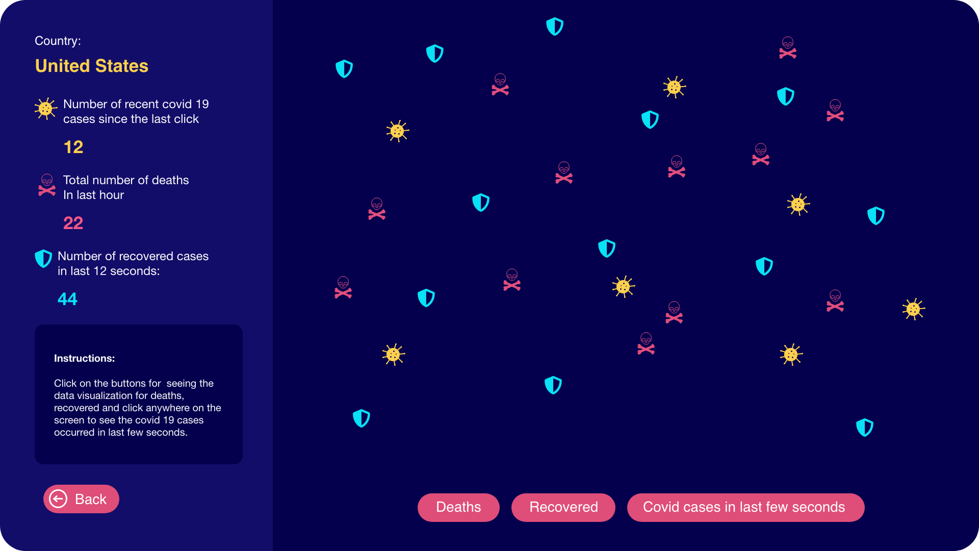
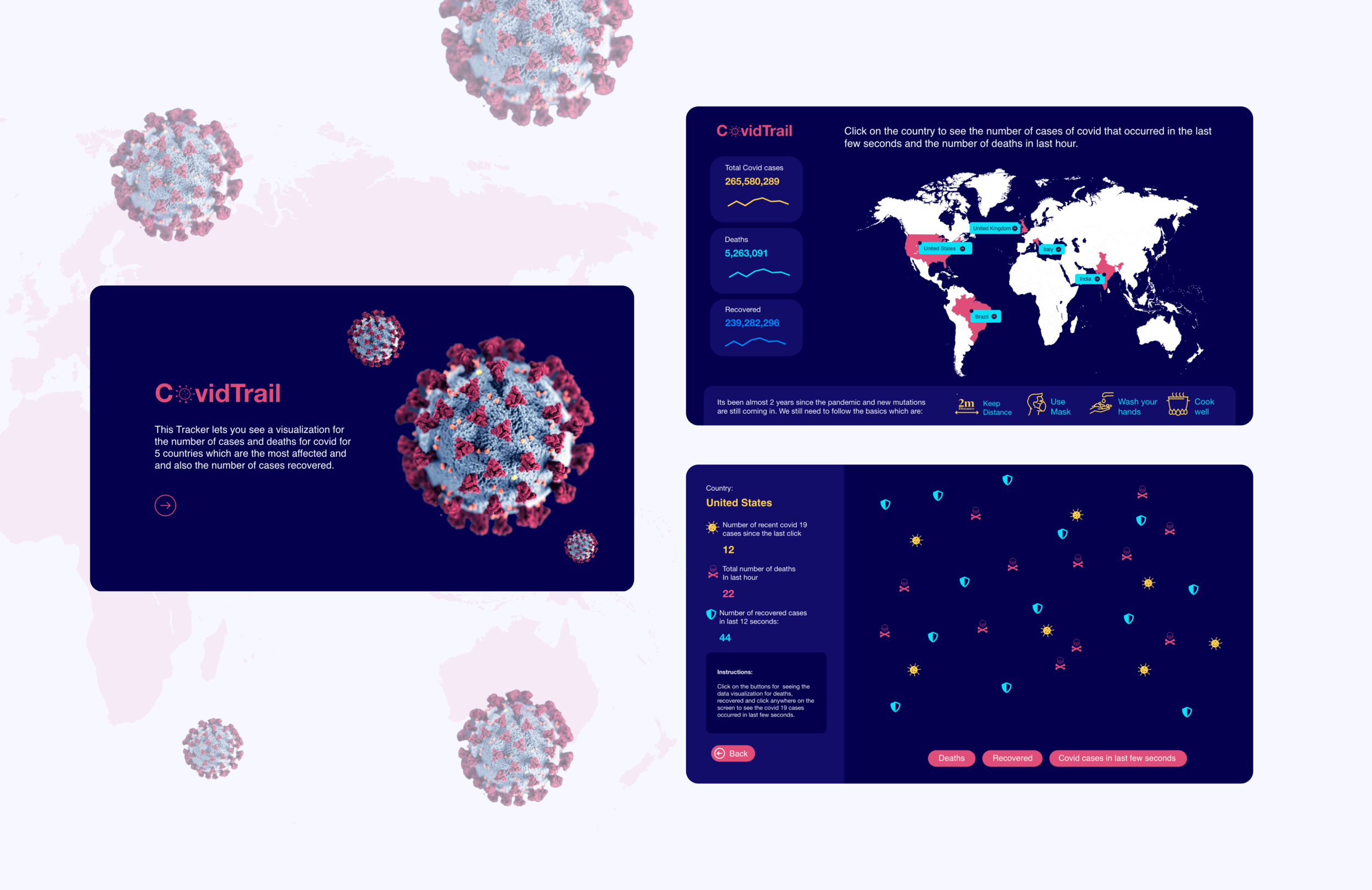
The application, after being accessed, redirects you to a map that will feature 5 major countries (United Kingdom, India, Brazil, Italy, and the United States) on it that are clickable. This will be noted by their nameplates being visible and a hover state that will indicate its clickability. Once the user clicks on the country they desire they will be greeted with a blank background image that will have text to prompt the user to click on the screen (in order to display the number of new cases on average in the region). Upon clicking the screen there will be an image(s) displayed that bounce left and right off the screen that represents a new case of covid (on average) that updates every time you click depending on when the user clicks. There will be a button on the left-hand side that will have text under it prompting the user to press it in order to display the number of people who have died of covid-19 in the last hour (in the region). Upon clicking we intend to have a different set of images to bounce off the walls of the screen animated in a similar fashion to the images representing the number of new cases. However, this image set doesn’t refresh. This format will be used for each region as well to limit confusion.
The envisioned user experience was to create a jarring reminder about the lethality and transmissibility of covid-19 by having the user see new cases pop up upon clicking. We believe this will have a profound impact on those who view it and will send a clear message about how certain regions are affected by the virus.
Initial design and concept
The initial sketches were rough but it implemented the data visualization part quite well, post which we moved to a bit more enhanced design around the same screens.
User testing and findings
After doing our user testing, we received a lot of different opinions on how we could improve our visualization and aesthetics as well. The testing of our prototype revealed that the information shown about COVID-19 hot zones is reliable and simple enough for almost anyone to understand. The users suggested that we should improve the navigation from the first page to the data visualization screen, improve the visuals and aesthetics, have numbers of these cases so people are able to compare the visualization with the number of cases, deaths, and recovered, and having a toggle that can allow users to turn on and off the visualization of the data for cases, death and recovery.
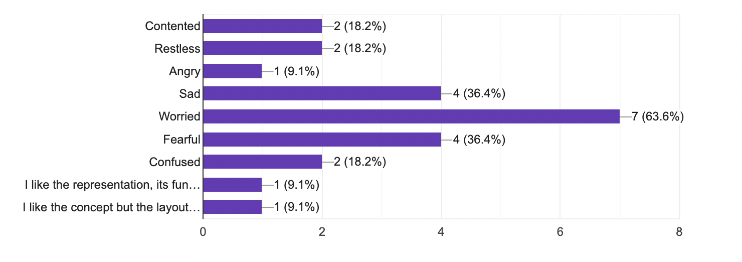
According to the survey and user testing done we found that more than 63% said they felt worried:
45.5% of users that user-tested were 25 years old.
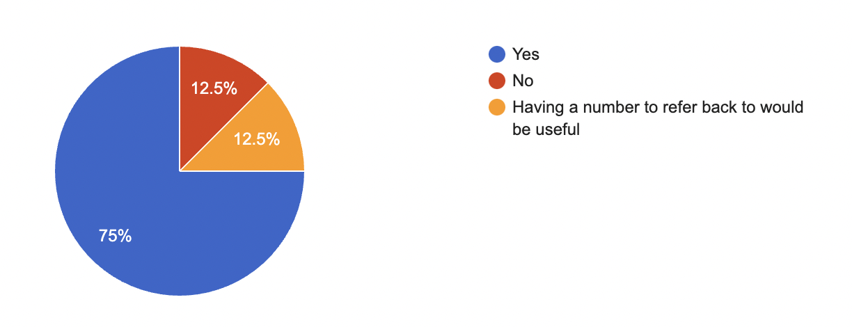
75% of the users felt that the visualization for covid cases and deaths are clear to them and 12.5 % weren’t satisfied, also another 12.5% of them said “having numbers to compare to would be useful”
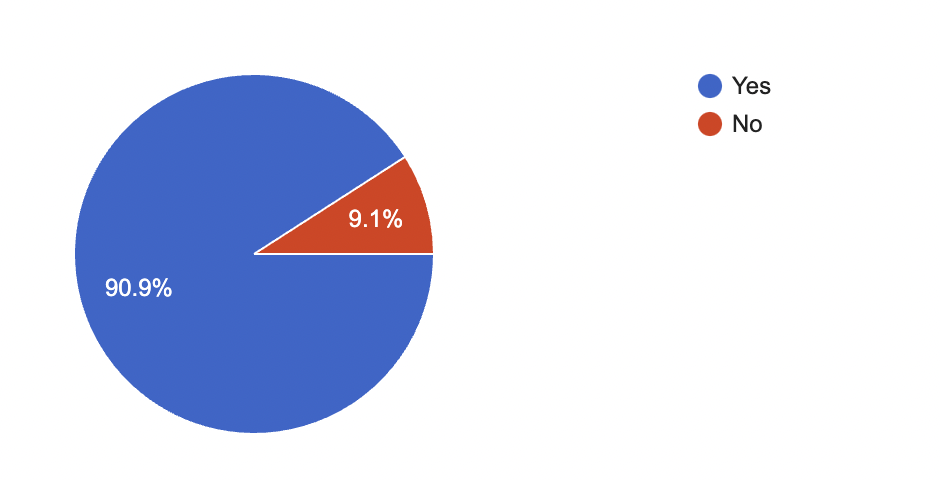
Almost 91% of users found the application informative and clear.
91% said they would use this application to stay updated
The application definitely made most of them feel uncomfortable because 63% said they felt worried, 36% each describes their emotion as sad and fearful,
While 18% were confused. Some felt restless and angry as well.
People also gave us detailed responses as to what they would want to see on screens. Most of them asked us to improve the aesthetics of screens and improve navigation.
We found that people feeling sad or worried also wanted something positive to be added to the visualization screen. For which we added the recovered case numbers and represented them with a shield icon in the final iteration.
We also received reviews of people in the form of voice recordings when they had more detailed information to give.
We found that users wanted icons to be of different colors, shapes, and sizes as well.
Final Prototype
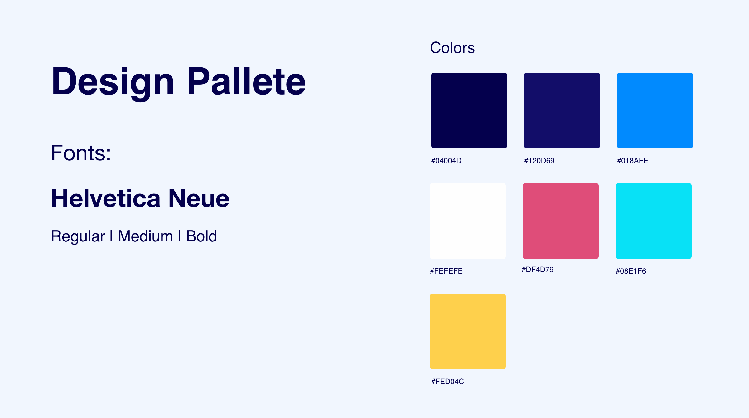
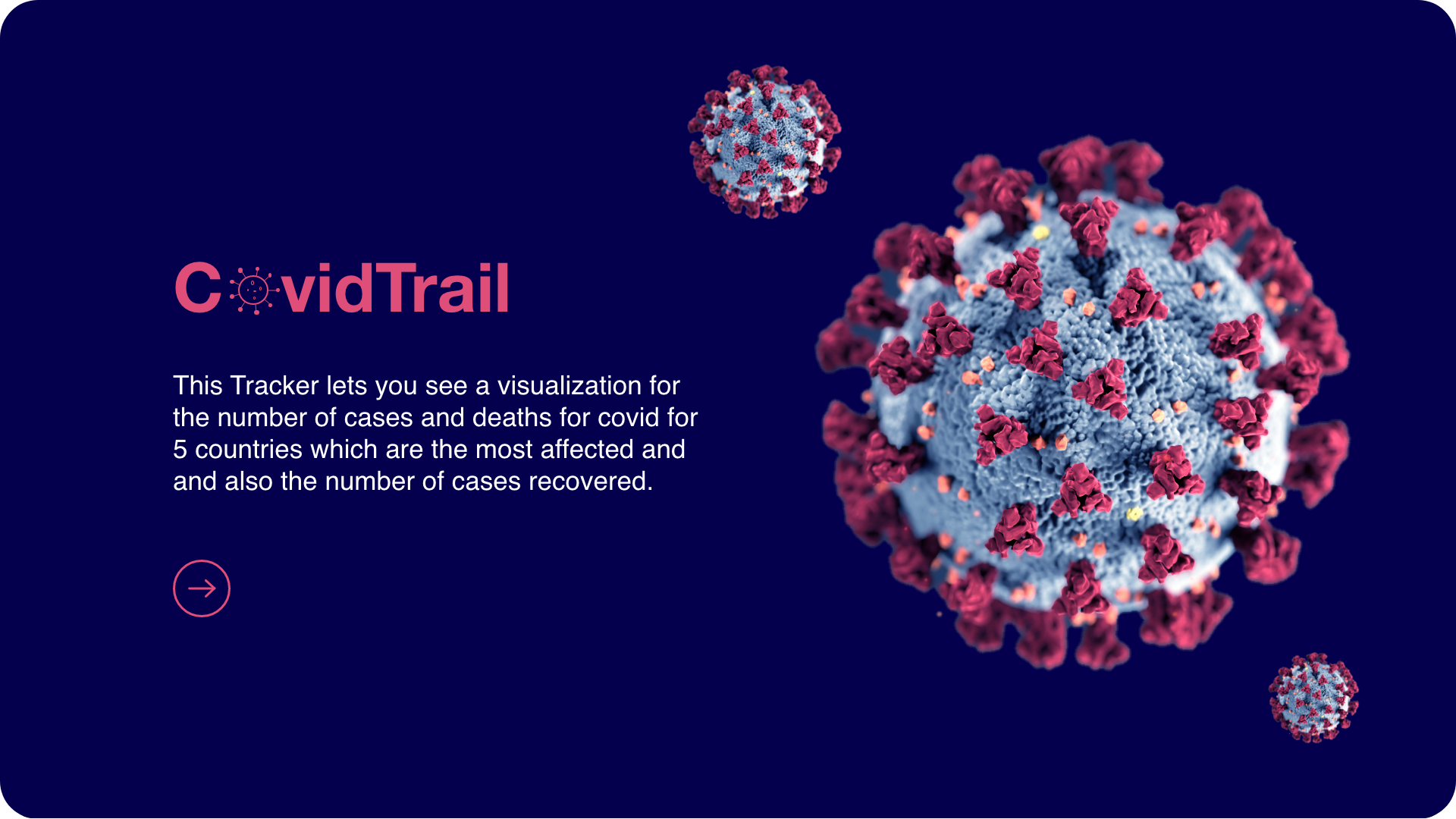
After the final iteration and considering all the pain points and needs that users showed us, we decided to add a new color palette to the application and also introduced a starting screen to it. There were a couple of changes that we applied in our final iteration after the user testing, like the clarity on what the application does, adding a different color to the country maps for which the data visualization is shown. We also used the dataset of the number of recovered cases and added another visualization onto the screen using a shield icon for the number of recovered cases at the last minute. We used a dark background to make the visualization more visually appealing and out there.
We used different colors of icons for cases, deaths and recovered. The visualization screen also shows numbers to compare to and instructions for the user to interact with the application.


